
Client: Peel PIZZA COMPANY
BUSINESS: BEN ORPHIC
ROLE: Logo & Identity Designer, DIGITAL DESIGNER

Case study

It’s difficult to cook a rustic and artisanal spirit into your food. Outside of the kitchen, we all search for that bite that is not only delicious, but effuses the warmth and love of the hands that made it.
In 2013, Peel Pizza Company opened up on South St. in Hingham, MA, at a corner store that had been occupied by 2 separate pizzerias previously. A decade later, the company has spread to four other locations, expanded its famous menu, and established itself as the South Shore’s premiere slice.
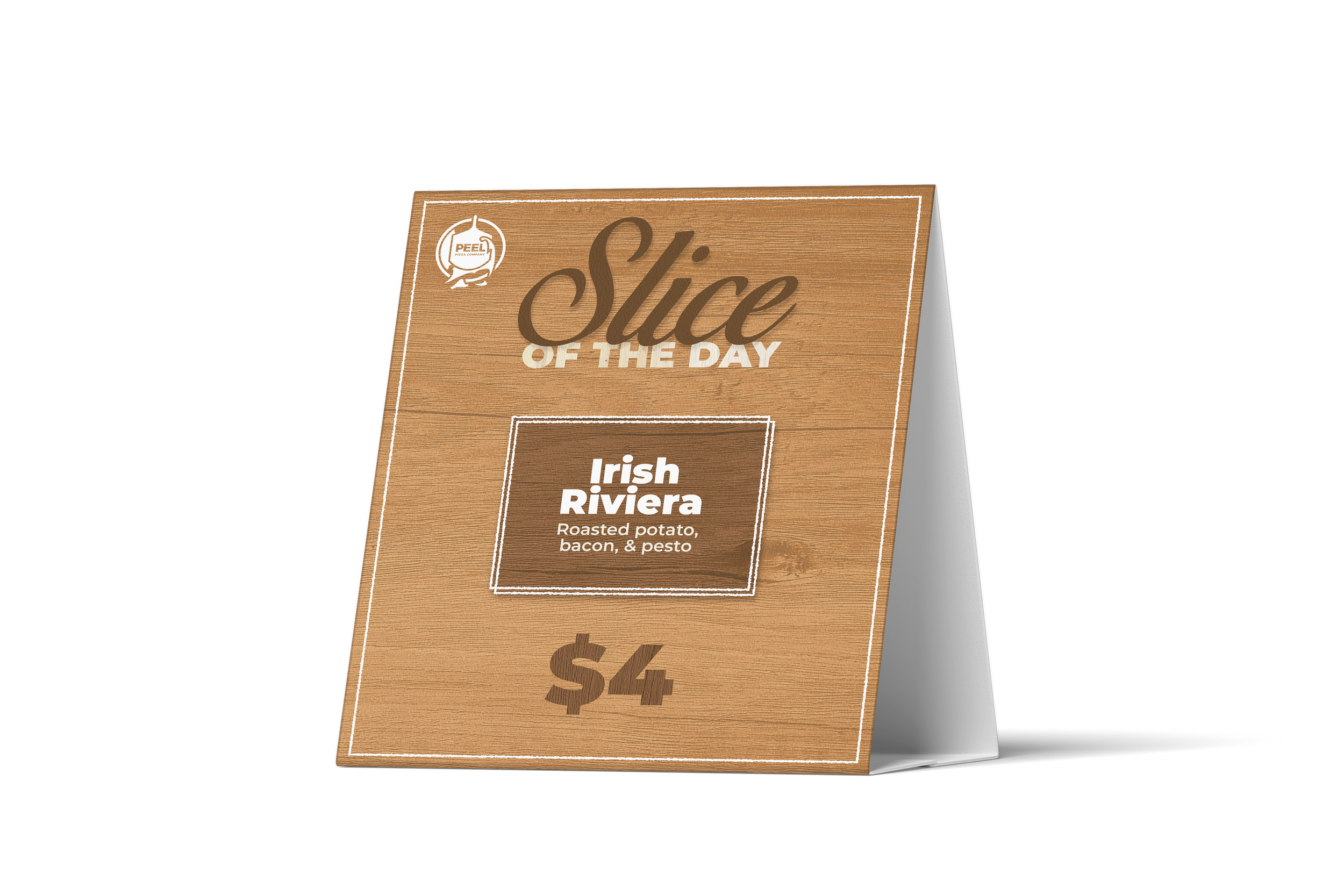
The owner hired Ben to overhaul the restaurant’s branding, mainly focusing on crafting a new logo that features the wooden peel of the company’s namesake— an artisanal tool that represents the care and craftsmanship of quality Neapolitan pizza.

“Ben’s work helped Peel further establish itself as a warm community-focused business. He solved a longstanding problem of ours— finding a look and feeling that perfectly conveyed our values as an artisinal pizzeria.”


PROCESS

After many years of growth, it was clear that Peel Pizza Company had become a household name across the South Shore of Massachusetts. In development, Ben took the owner’s desire to focus on the wooden peel, and combined it with the enormous sense of pride for living south of Boston. This involved carving the recognizable neck of Cape Cod through the peel’s icon. After settling on a well-balanced and compact badge logo-mark, Ben channeled the artisanal and rustic spirit of the restaurant through two distinct wooden textures.