PROJECT: THRU THE PRISM
BUSINESS: BEN ORPHIC, THRU THE PRISM
ROLE: DIGITAL DESIGNER, EDITORIAL DESIGNER, PRINT DESIGNER
CASE STUDY
As legal cannabis dispensaries sprout in many American cities, our art, music, and culture has become a bit more colorful and psychedelic. Stigmas are shifting. Plants and fungi are growing in the heart of medicinal research, mental health, and that “wilderness retreat” your Uncle attended in July. The old flower power of the 1960’s is back, and it’s as potent as ever.
Just as before, the budding flower of this movement is music and art. With new technologies now further distorting the power of our minds, Thru the Prism was created to tell the psychedelic stories of artists and musicians across the world. The magazine and blog-space artfully documents a new type of psychonaut– helping to de-stigmatize psychedelia, preserve the powerful nostalgia of its mother movement, and further explore the deeply mystical heart of human creativity.
VISUAL IDENTITY, THEMES, & STYLES
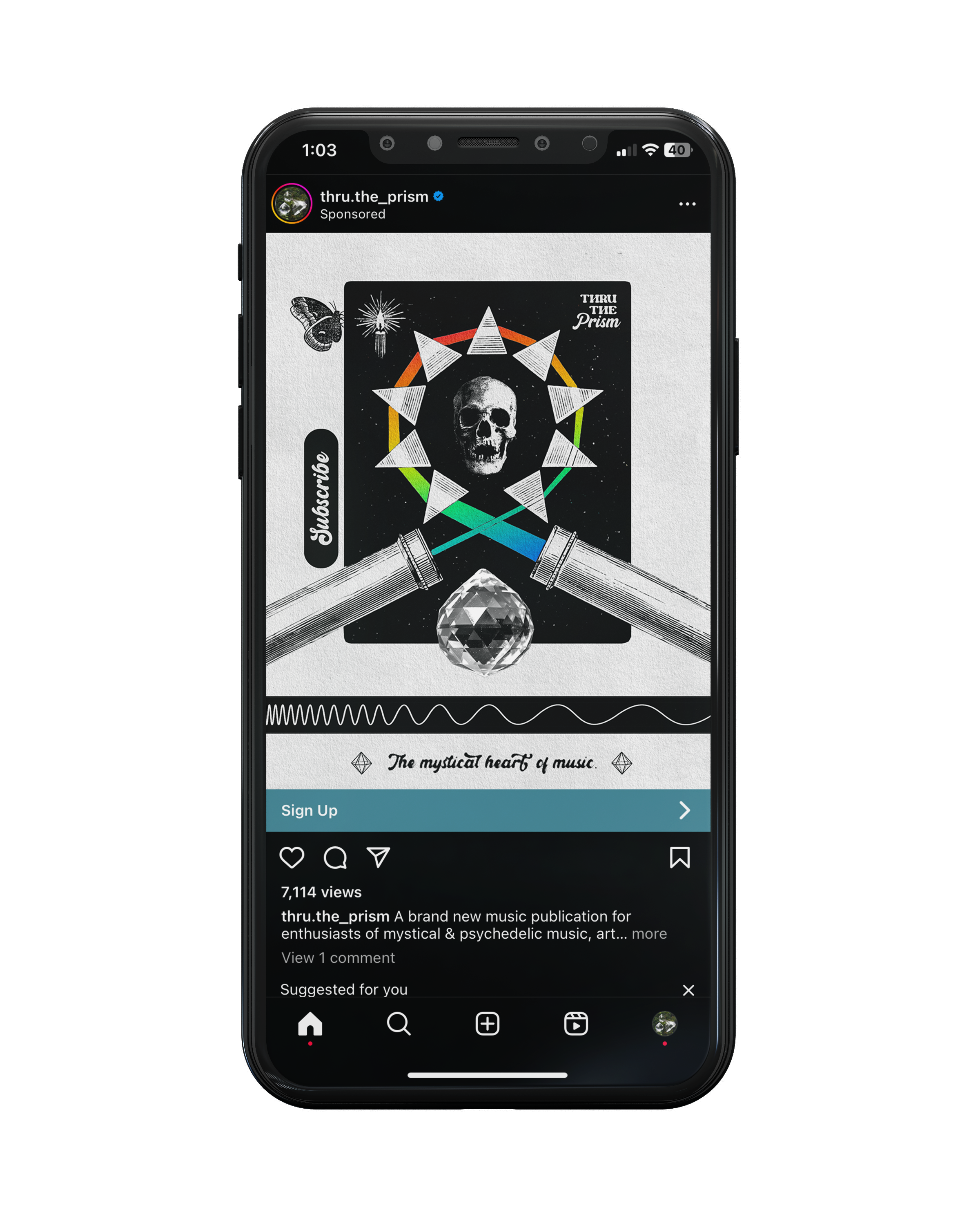
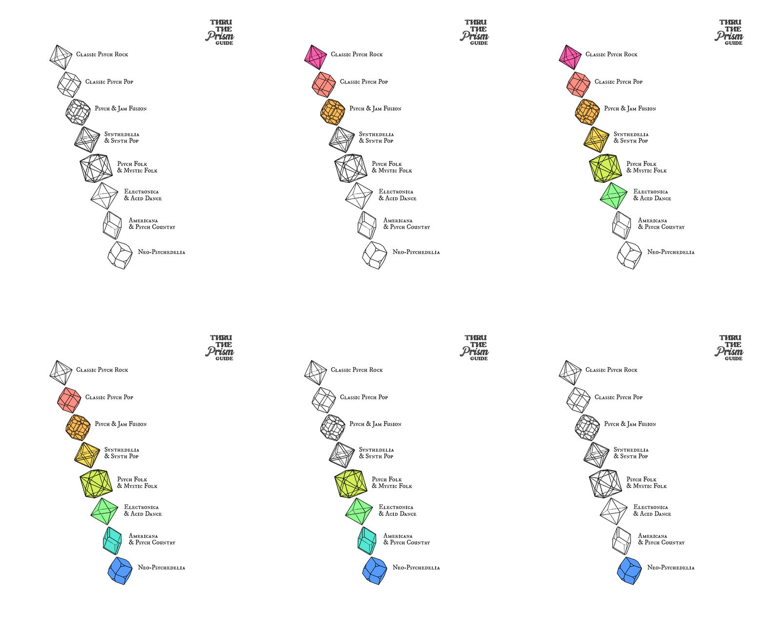
The assignment was to conceive brand systems and marketable imagery for the psychedelic niche; specifically a style and feel that invokes both an occult and cosmic essence, without seeming too pastiche or shamanic. The identity of the brand quickly narrowed to a collection of ghoulish iconography and iterations of various prisms, crystals, and their spectral refractions— analogizing a reader’s ear, brain, and taste to a piece of glass that light (or music) bends through.
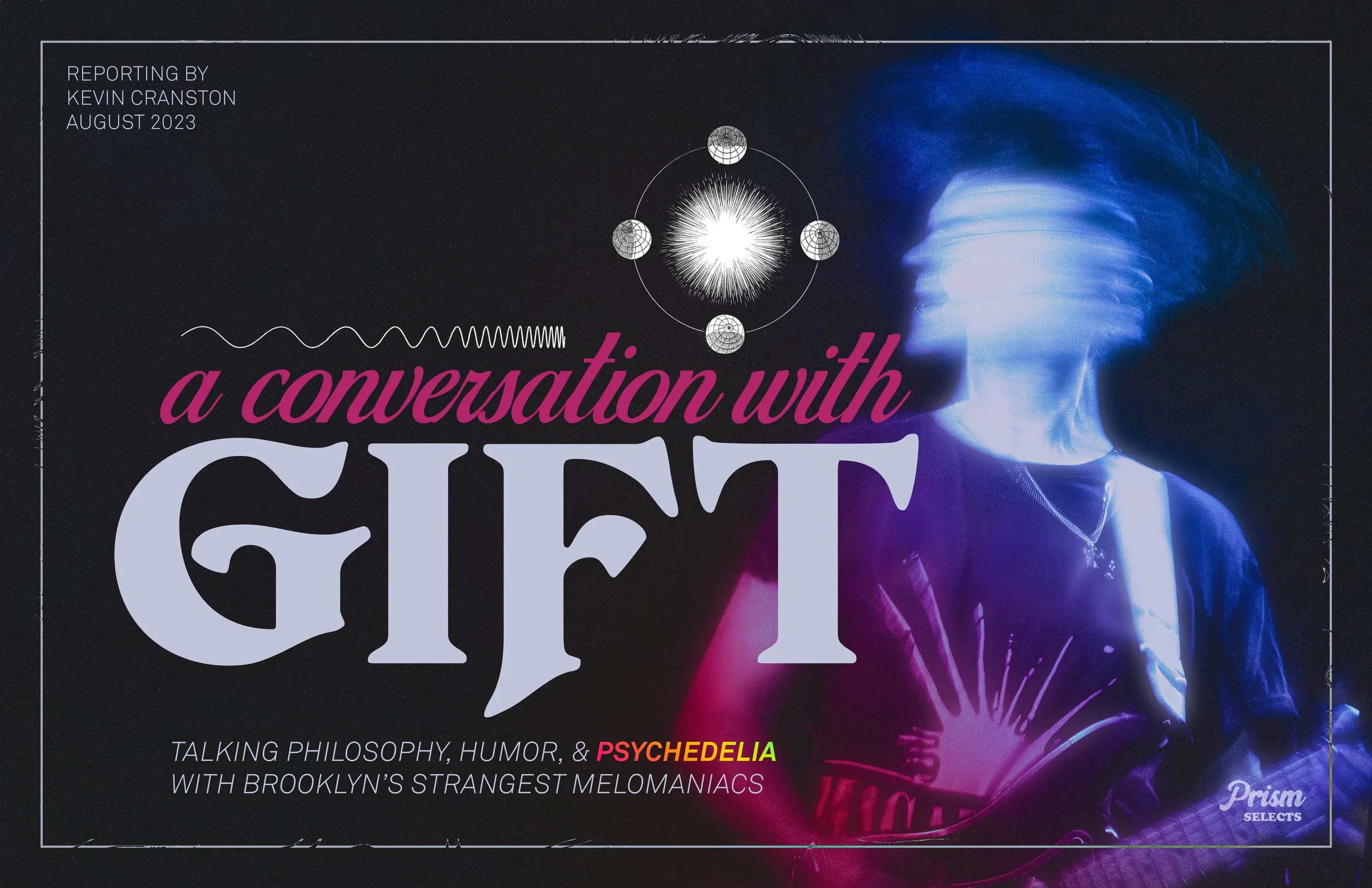
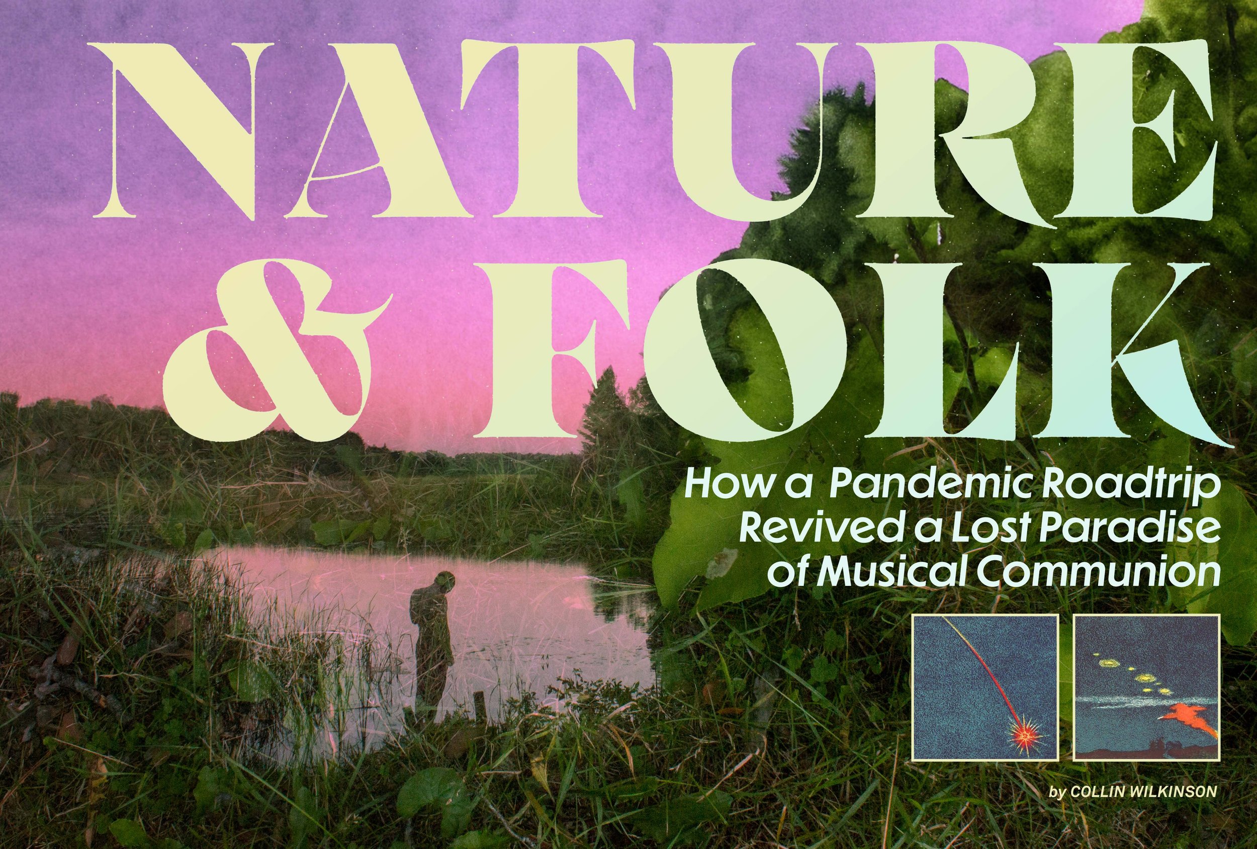
EDITORIAL CONCEPT WORK
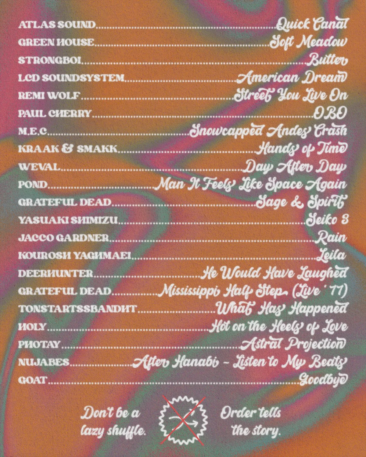
Playlist Cards for Social Media
Tracklist and Playlist Design - Linked Playlist Card for Social Media (Instagram)
Tracklist and Playlist Design - Linked Playlist Card for Social Media (Instagram)
Wordmark Pattern
Social Media (Instagram) Review Card, 4:5 Aspect Ratio
Facebook Header (16:9 Aspect Ratio)
Website Header


